
Desktop result
Desktop performance stays stable while keeping the full B2B narrative and visual hierarchy intact.
The business sells whole-system delivery - yet the old experience read like a small fixer: isolated service pages, patchwork tone, no clear picture of how disciplines connect in one architecture. Buyers could not see that access, CCTV, fire, voice, networks, and IT are scoped, installed, and serviced as one programme. High-trust signals - governance, documentation, monitoring, partner tiers - were buried or missing, so both procurement and technical gatekeepers underestimated the firm.
Make B2B credibility the default first impression - the opposite of a trades call-out site. Narrative and IA must show integration across services: how subsystems share infrastructure, handoffs, and long-term operation. Do that without exposing sensitive client imagery or breaching confidentiality. Scale a repeatable page grammar from flagship pages to deep specs, and earn search visibility through substantive structure and internal linking - not thin duplicate URLs.
Delivery split into clear lanes. UX: moderated usability research, task-based evaluation of trust and findability. UI: visual system, components, and responsive layouts that read enterprise, not handyman. Information architecture: the journey model intent → integrated scope → evidence → enquiry. Code: semantic HTML, CSS, and JavaScript with shared primitives from wide desktop to phone. SEO: logical headings, crawlable sections, and internal links that reinforce the single-system story. Field-credible photography and restrained CTAs thread the same B2B read throughout - validated on real devices, not only in comps.
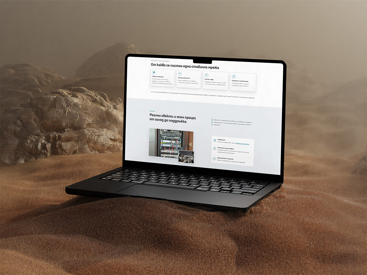
We aligned videonabliudenie.bg with how the business actually sells and delivers: whole-system B2B security and IT-not a patchwork of one-off jobs. Moderated UX research, information architecture, enterprise UI, semantic front-end code, and on-page SEO now tell one integrated story across roughly fifteen live routes.
Isolated service pages and uneven tone hid whole-system delivery. Buyers could not see access, CCTV, fire, voice, networks, and IT as one programme-scoped, installed, and serviced together.
Governance, documentation, monitoring, and partner tiers-the proof procurement and technical gatekeepers look for-were missing or hard to find, so the firm was underestimated.
The experience had to read as integrated B2B-how subsystems share infrastructure, handoffs, and long-term operation-without exposing sensitive client imagery or breaching confidentiality.
We scaled a repeatable page grammar from flagship pages to deep technical specs and improved search visibility with substantive structure and internal linking-replacing a thin legacy footprint, not thin duplicate URLs.
Similar technical B2B story to untangle? Ask how we combine usability research, IA, build, and SEO.

Stakeholders arrived with different mental models - facilities, IT, and procurement - so we needed to see what erodes trust in the first minute and where high-value services disappear. Moderated usability with paired technical and commercial profiles, focused on discovery, proof, and enquiry, showed that authentic site photography consistently outperformed stock. We elevated aftercare, monitoring, and partner tiers in the hierarchy so they are visible in the journey, not buried in footnotes.

Decisions increasingly start on a handset, mid-site or in transit, which meant preserving hierarchy and density without shrinking the story to a brochure strip. We stress-tested the grid, type ramp, and module stack at critical breakpoints and tuned card density and tap targets. Services, reference material, and enquiry now read clearly in one thumb-driven pass - without a separate “mobile lite” layout.

The client needed the brand to register as B2B first - not as a neighbourhood installer. The hero had over-weighted one discipline, which made the portfolio look narrow. We rebalanced access, life-safety, networks, voice evacuation, and IT as facets of one delivery programme - design, commissioning, documentation, handover - instead of unrelated SKUs, so the tone matches a systems integrator rather than a retail counter.

Design fidelity usually dies somewhere between layout files and production CSS; here the requirement was a single component layer that search engines can parse and engineers can extend. Custom markup and styles share primitives; internal links and section landmarks define crawl paths. The shipped build holds parity from large desktop to narrow phone on real hardware - with fewer regressions than a typical page-builder handoff tolerates.

URLs had multiplied without a governing story; each service read in isolation, which undermined the integrated system the client sells. The model mirrors how buyers de-risk: mandate, unified scope across subsystems, vendor proof, then contact. A four-stage spine repeats as section DNA on long templates, so specifications stay skimmable and every page reinforces how the stack works as one - not a new narrative per URL.

The old experience traded on claims while buyers were asking for receipts - competence had to read clearly before the first call. Reference environments, manufacturer alignment, and programme depth sit forward; decorative content that mimics a publishing cadence was stripped. Conversations now start further down the funnel, with scope, sector, and delivery questions instead of baseline credentialing.
Visually, the site could not look like a patchwork of trade ads; it had to support the same B2B, whole-system story as the copy. The design language is tight: a small palette, two typographic registers, and repeatable surfaces that stay calm through long technical passages - institutional weight, not promotional noise.
Deep navy carries persistent chrome; teal aligns with the marque for engineering cues; cool neutrals carve breathing room between argument blocks. One yellow channel owns primary conversion - visible on the shipped interface without carnival contrast.
Display styles carry the thesis; body styles carry the specification. Vertical rhythm and card shells repeat so FAQs, sector call-outs, and service matrices share one cadence - readers sense a single authored system, not a theme with ad hoc exceptions.

Performance validation with desktop and mobile snapshots from PageSpeed-style audits. Focus areas: faster first render, shorter critical request path, and improved loading behavior before users reach key B2B service pages.
Desktop performance stays stable while keeping the full B2B narrative and visual hierarchy intact.

Mobile gains focus on faster rendering and cleaner loading behavior, reducing friction for first-time visitors.
The live property now supports the client’s core ask: B2B-first positioning and a clear integrated-system story from the hero through the deepest service view - backed by the same rigour as their commissioning practice: traceable structure, defensible claims, and enquiry paths aligned with how capital equipment is bought.
Commercial - the “small fixer” read is retired in favour of integrator credibility; reference-led proof and manufacturer alignment land before generic marketing noise, and programmes are discoverable without a site map hunt.
Editorial - for this audience, thought-leadership chrome underperformed against operational narrative; the experience doubles down on delivery evidence instead.
Delivery - UX (research, IA, flows), UI (visual and interaction design), code, and SEO stayed under one owner from discovery through launch, so intent did not fragment across handoffs.
Additional desktop and handset captures - material not shown in the process slider - for a closer read of finish, spacing, and motionless craft.


Explore more of our work and discover how we transform digital experiences.